Having Fun with Tidy Text!
Julia Silge and David Robinson have a wonderful new book called “Text Mining with R” which has a companion website with great explanations and examples. Here are some additional applications of those examples on a corpus of geotagged Instagram posts from the Mission District neighborhood in San Francisco.
# Make sure you have the right packages!
packs = c("twitteR","RCurl","RJSONIO","stringr","ggplot2","devtools","DataCombine","ggmap",
          "topicmodels","slam","Rmpfr","tm","stringr","wordcloud","plyr",
          "tidytext","dplyr","tidyr","xlsx","scales","ggrepel","lubridate","purrr","broom")
lapply(packs, library, character.only=T)
The data need to be processed a bit more in order to analyze them. Let’s try from the start with Silge and Robinson.
# Get rid of stuff particular to the data (here encodings of links and such)
# Most of these are characters I don't have encodings for (other scripts, etc.)
tweets$text = gsub("Just posted a photo","", tweets$text)
tweets$text = gsub( "<.*?>", "", tweets$text)
# Get rid of super frequent spam posters
tweets <- tweets[! tweets$screenName %in% c("4AMSOUNDS",
"BruciusTattoo","LionsHeartSF","hermesalchemist","Mrsourmash"),]
# Now for Silge and Robinson's code. What this is doing is getting rid of URLs, re-tweets (RT) and ampersands. This also gets rid of stop words without having to get rid of hashtags and @ signs by using str_detect and filter!
reg <- "([^A-Za-z_\\d#@']|'(?![A-Za-z_\\d#@]))"
tidy_tweets <- tweets %>%
filter(!str_detect(text, "^RT")) %>%
mutate(text = str_replace_all(text, "https://t.co/[A-Za-z\\d]+|http://[A-Za-z\\d]+|&|<|>|RT|https", "")) %>%
unnest_tokens(word, text, token = "regex", pattern = reg) %>%
filter(!word %in% stop_words$word,
str_detect(word, "[a-z]"))Awesome! Now our posts are cleaned with the hashtags and @ mentions still intact. What we can try now is to plot the frequency of some of these terms according to WHERE they occur. Silge and Robinson have an example with persons, let’s try with coordinates.
freq <- tidy_tweets %>%
  group_by(latitude,longitude) %>%
  count(word, sort = TRUE) %>%
  left_join(tidy_tweets %>%
              group_by(latitude,longitude) %>%
              summarise(total = n())) %>%
  mutate(freq = n/total)

freq
## Source: local data frame [61,008 x 6]
## Groups: latitude, longitude [1,411]
##
## latitude longitude word n total freq
## <dbl> <dbl> <chr> <int> <int> <dbl>
## 1 37.76000 -122.4200 mission 1844 21372 0.08628112
## 2 37.76000 -122.4200 san 1592 21372 0.07448999
## 3 37.76000 -122.4200 district 1576 21372 0.07374134
## 4 37.76000 -122.4200 francisco 1464 21372 0.06850084
## 5 37.75833 -122.4275 park 293 2745 0.10673953
## 6 37.75833 -122.4275 mission 285 2745 0.10382514
## 7 37.75833 -122.4275 dolores 278 2745 0.10127505
## 8 37.76000 -122.4200 #sanfrancisco 275 21372 0.01286730
## 9 37.76300 -122.4209 alley 245 2273 0.10778707
## 10 37.76300 -122.4209 clarion 242 2273 0.10646722
## # ... with 60,998 more rowsThe n here is the total number of times this term has shown up, and the total is how many terms there are present in a particular coordinate.
Cool! Now we have a representation of terms, their frequency and their position. Now I might want to plot this somehow… one way would be to try to plot the most frequent terms (n > 50) (Some help on how to do this was taken from here and here).
freq2 <- subset(freq, n > 50)

map <- get_map(location = 'Valencia St. and 20th, San Francisco,
               California', zoom = 15)

freq2$longitude<-as.numeric(freq2$longitude)
freq2$latitude<-as.numeric(freq2$latitude)
lon <- freq2$longitude
lat <- freq2$latitude

mapPoints <- ggmap(map) + geom_jitter(alpha = 0.1, size = 2.5, width = 0.25, height = 0.25) +
geom_label_repel(data = freq2, aes(x = lon, y = lat, label = word),size = 2) 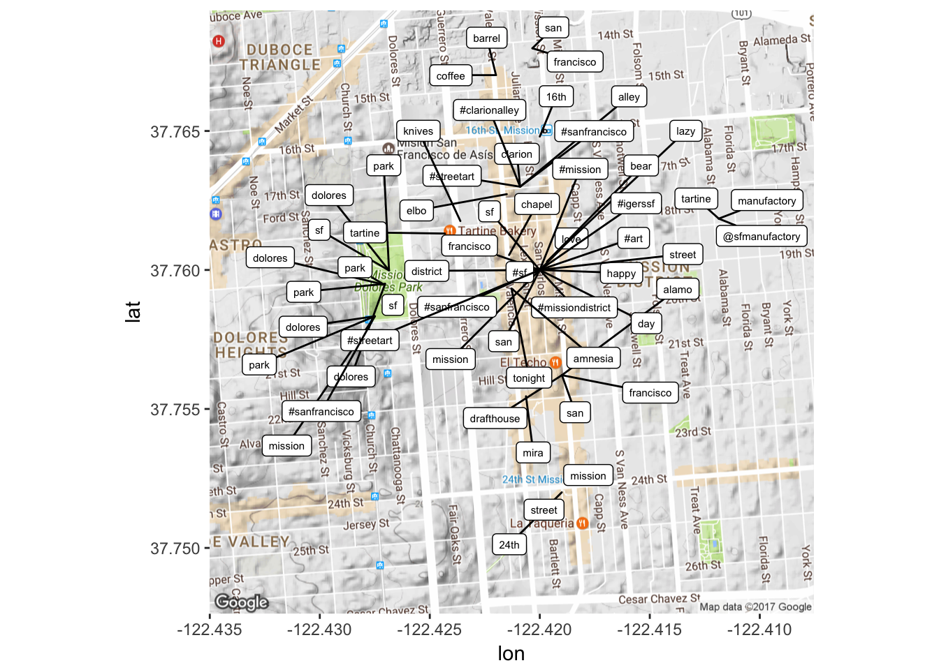
Let’s zoom into that main central area to see what’s going on!
map2 <- get_map(location = 'Lexington St. and 19th, San Francisco,
               California', zoom = 16)
mapPoints2 <- ggmap(map2) + geom_jitter(alpha = 0.1, size = 2.5, width = 0.25, height = 0.25) +
geom_label_repel(data = freq2, aes(x = lon, y = lat, label = word),size = 2) 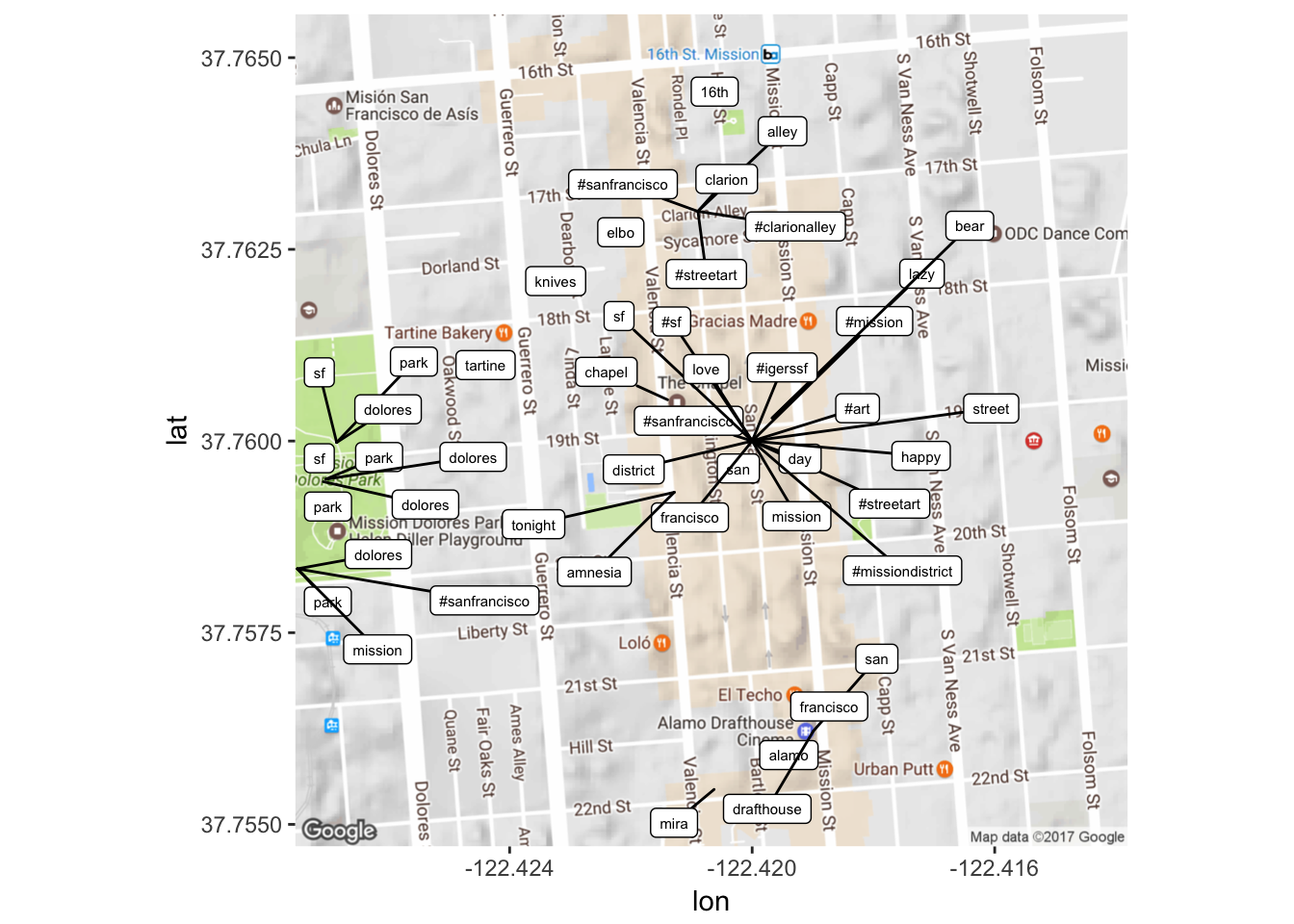
This can be manipulated in many different ways – either by playing with what frequency of terms you want to look at (maybe I want to see terms that occur 100 times, between 20 and 50 times, less than 20 times etc. etc.) OR by playing around with the map. At the moment though, this is pretty illuminating in the sense that it shows us that the most frequency terms are focused around certain ‘hotspots’ in the area, which in itself is just kind of cool to see.
Now let’s try out word frequency changes over time: what words were used more or less over the time of data collection? (Help from here) (Also used the lubridate package to help with time.)
# Might have to do this first
tidy_tweets$created2 <- as.POSIXct(tidy_tweets$created, format="%m/%d/%Y %H:%M")

words_by_time <- tidy_tweets %>%
  mutate(time_floor = floor_date(created2, unit = "1 week")) %>%
  count(time_floor, word) %>%
  ungroup() %>%
  group_by(time_floor) %>%
  mutate(time_total = sum(n)) %>%
  group_by(word) %>%
  mutate(word_total = sum(n)) %>%
  ungroup() %>%
  rename(count = n) %>%
  filter(word_total > 100)

words_by_time
## # A tibble: 1,979 × 5
## time_floor word count time_total word_total
## <dttm> <chr> <int> <int> <int>
## 1 0016-07-31 #art 7 2729 120
## 2 0016-07-31 #california 9 2729 149
## 3 0016-07-31 #dolorespark 6 2729 168
## 4 0016-07-31 #mission 5 2729 222
## 5 0016-07-31 #missiondistrict 1 2729 158
## 6 0016-07-31 #sanfrancisco 38 2729 1034
## 7 0016-07-31 #sf 23 2729 603
## 8 0016-07-31 #streetart 12 2729 229
## 9 0016-07-31 24th 10 2729 109
## 10 0016-07-31 alamo 3 2729 111
## # ... with 1,969 more rowsAlright, now we want to figure out those words that have changed the most in their frequency over time so as to isolate ones of interests to plot over time. This involves a few steps though.
nested_data <- words_by_time %>%
  nest(-word)
nested_data
## # A tibble: 71 × 2
## word data
## <chr> <list>
## 1 #art <tibble [26 × 4]>
## 2 #california <tibble [28 × 4]>
## 3 #dolorespark <tibble [27 × 4]>
## 4 #mission <tibble [28 × 4]>
## 5 #missiondistrict <tibble [29 × 4]>
## 6 #sanfrancisco <tibble [29 × 4]>
## 7 #sf <tibble [29 × 4]>
## 8 #streetart <tibble [28 × 4]>
## 9 24th <tibble [28 × 4]>
## 10 alamo <tibble [27 × 4]>
## # ... with 61 more rowsProcess as described by Silge and Robinson: “This data frame has one row for each person-word combination; the data column is a list column that contains data frames, one for each combination of person and word. Let’s use map() from the purrr library to apply our modeling procedure to each of those little data frames inside our big data frame. This is count data so let’s use glm() with family =”binomial" for modeling. We can think about this modeling procedure answering a question like, “Was a given word mentioned in a given time bin? Yes or no? How does the count of word mentions depend on time?”"
nested_models <- nested_data %>%
  mutate(models = map(data, ~ glm(cbind(count, time_total) ~ time_floor, .,
                                  family = "binomial")))

nested_models
## # A tibble: 71 × 3
## word data models
## <chr> <list> <list>
## 1 #art <tibble [26 × 4]> <S3: glm>
## 2 #california <tibble [28 × 4]> <S3: glm>
## 3 #dolorespark <tibble [27 × 4]> <S3: glm>
## 4 #mission <tibble [28 × 4]> <S3: glm>
## 5 #missiondistrict <tibble [29 × 4]> <S3: glm>
## 6 #sanfrancisco <tibble [29 × 4]> <S3: glm>
## 7 #sf <tibble [29 × 4]> <S3: glm>
## 8 #streetart <tibble [28 × 4]> <S3: glm>
## 9 24th <tibble [28 × 4]> <S3: glm>
## 10 alamo <tibble [27 × 4]> <S3: glm>
## # ... with 61 more rowsSilge and Robinson: “Now notice that we have a new column for the modeling results; it is another list column and contains glm objects. The next step is to use map() and tidy() from the broom package to pull out the slopes for each of these models and find the important ones. We are comparing many slopes here and some of them are not statistically significant, so let’s apply an adjustment to the p-values for multiple comparisons.”
slopes <- nested_models %>%
  unnest(map(models, tidy)) %>%
  filter(term == "time_floor") %>%
  mutate(adjusted.p.value = p.adjust(p.value))
“Now let’s find the most important slopes. Which words have changed in frequency at a moderately significant level in our tweets?”
top_slopes <- slopes %>%
  filter(adjusted.p.value < 0.1)

top_slopes
## # A tibble: 16 × 7
## word term estimate std.error statistic
## <chr> <chr> <dbl> <dbl> <dbl>
## 1 #dolorespark time_floor -1.239208e-07 1.877375e-08 -6.600749
## 2 #sanfrancisco time_floor -3.211771e-08 6.679608e-09 -4.808322
## 3 #sf time_floor -3.483812e-08 8.745735e-09 -3.983441
## 4 alley time_floor -7.976653e-08 1.277341e-08 -6.244732
## 5 clarion time_floor -9.680816e-08 1.449039e-08 -6.680855
## 6 district time_floor 6.701575e-08 5.346673e-09 12.534102
## 7 dolores time_floor -1.132466e-07 7.718189e-09 -14.672698
## 8 francisco time_floor 4.515439e-08 4.642235e-09 9.726865
## 9 manufactory time_floor -7.442008e-08 1.672651e-08 -4.449228
## 10 mission time_floor 3.625027e-08 3.999962e-09 9.062656
## 11 park time_floor -1.134007e-07 7.699185e-09 -14.728916
## 12 san time_floor 4.009249e-08 4.369834e-09 9.174832
## 13 sf time_floor -9.883069e-08 7.359724e-09 -13.428586
## 14 street time_floor -5.396273e-08 1.121572e-08 -4.811349
## 15 tartine time_floor -6.296002e-08 1.209275e-08 -5.206427
## 16 valencia time_floor -8.125194e-08 2.093658e-08 -3.880859
## # ... with 2 more variables: p.value <dbl>, adjusted.p.value <dbl>Let’s plot them!
words_by_time %>%
  inner_join(top_slopes, by = c("word")) %>%
  ggplot(aes(time_floor, count/time_total, color = word)) +
  geom_line(size = 1.3) +
  labs(x = NULL, y = "Word frequency")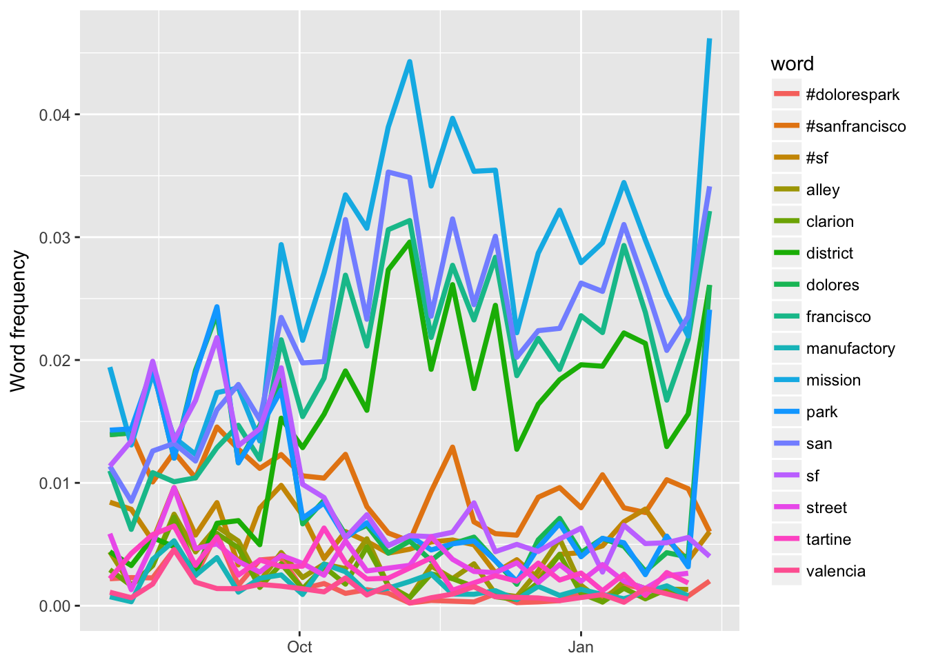
After looking at some of these features of our data set, it’s time to explore TOPIC MODELING, or (paraphrasing from David Blei) finding structure in more-or-less unstructured documents. To do this we need a document-term matrix. At the moment, the tweets are a little problematic in that they are broken up by words… whereas we actually would like the text of the tweet back as that is what we are treating as our ‘document’. The question at the moment is… do we want to keep the hashtags / can we?
# Let's try by taking our tweets that have been tidied already. First we need to count each word though, and create some kind of column that has
# This first one is helpful for seeing encodings that need to be removed
tidy_tweets %>%
  count(document, word, sort=TRUE)
## Source: local data frame [102,888 x 3]
## Groups: document [14,958]
##
## document word n
## <int> <chr> <int>
## 1 5932 facewithtearsofjoy 17
## 2 8849 balloon 8
## 3 12204 blackquestionmarkornament 8
## 4 7697 nov 7
## 5 7697 wed 7
## 6 12204 whitequestionmarkornament 7
## 7 2110 sliceofpizza 6
## 8 2452 nailpolish 6
## 9 2741 facewithnogoodgesture 6
## 10 4014 earofrice 6
## # ... with 102,878 more rows# Counting words so we can make a dtm with our preserved corpus with hashtags and such
tweet_words <- tidy_tweets %>%
count(document, word) %>%
ungroup()
total_words <- tweet_words %>%
group_by(document) %>%
summarize(total = sum(n))
post_words <- left_join(tweet_words, total_words)
post_words## # A tibble: 102,888 × 4
## document word n total
## <int> <chr> <int> <int>
## 1 1 #nofilter 1 7
## 2 1 #sanfrancisco 1 7
## 3 1 afternoon 1 7
## 4 1 dolores 1 7
## 5 1 park 2 7
## 6 1 sf 1 7
## 7 2 @publicworkssf 1 5
## 8 2 #dustyrhino 1 5
## 9 2 close 1 5
## 10 2 grin 1 5
## # ... with 102,878 more rowsnew_dtm <- post_words %>%
cast_dtm(document, word, n)This seems to have worked :O :O :O Let’s see how topic modeling works here now…
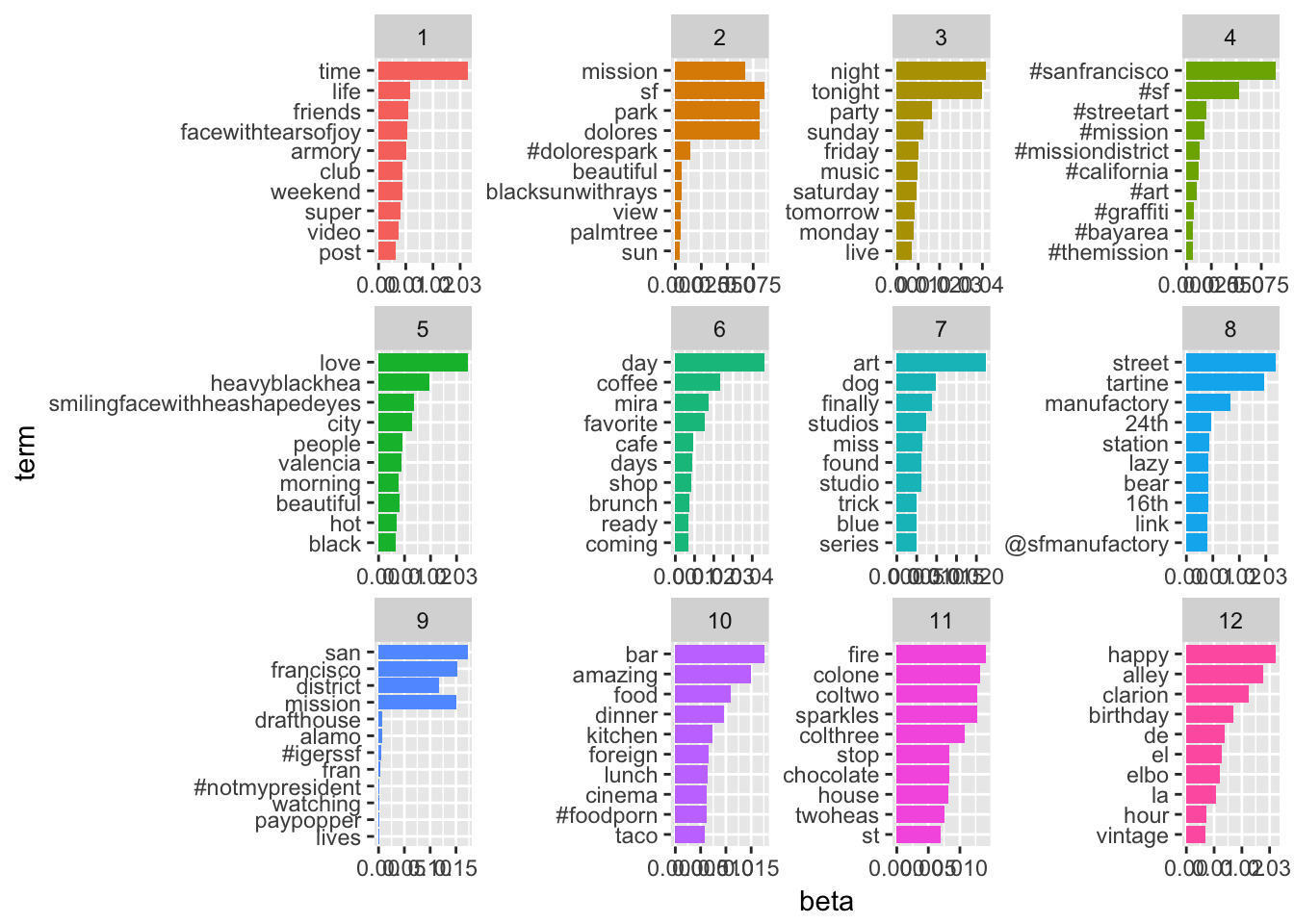
Visualization in TIDY form also from Silge and Robinson!
#Set parameters for Gibbs sampling (parameters those used in
#Grun and Hornik 2011)
burnin <- 4000
iter <- 2000
thin <- 500
seed <-list(2003,5,63,100001,765)
nstart <- 5
best <- TRUE
k <- 12
test_lda2 <-LDA(new_dtm,k, method="Gibbs",
             control=list(nstart=nstart, seed = seed, best=best,
                          burnin = burnin, iter = iter, thin=thin))

# Make that TIDY!!!
test_lda_td2 <- tidy(test_lda2)

lda_top_terms2 <- test_lda_td2 %>%
  group_by(topic) %>%
  top_n(10, beta) %>%
  ungroup() %>%
  arrange(topic, -beta)

lda_top_terms2 %>%
  mutate(term = reorder(term, beta)) %>%
  ggplot(aes(term, beta, fill = factor(topic))) +
  geom_bar(stat = "identity", show.legend = FALSE) +
  facet_wrap(~ topic, scales = "free") +
  coord_flip()