Adventures in Text Mining
There are many wonderful tutorials on how to work with Twitter REST APIs (even a video walk-through here) so I won’t describe that process. Instead, I will show some examples of using the twitteR and related packages to look at geotagged posts occurring within a specific neighborhood (i.e. how to use the searchTwitter() function in twitteR to search by location, not specific search term). I will also be using methods described in Julia Silge and David Robinson’s new book.
packs = c("twitteR","RCurl","RJSONIO","stringr","ggplot2","devtools","DataCombine","ggmap",
          "topicmodels","slam","Rmpfr","tm","stringr","wordcloud","plyr",
          "tidytext","dplyr","tidyr","xlsx")
lapply(packs, library, character.only=T)
# key = "YOUR KEY HERE"
# secret = "YOUR SECRET HERE"
# tok = "YOUR TOK HERE"
# tok_sec = "YOUR TOK_SEC HERE"
twitter_oauth <- setup_twitter_oauth(key, secret, tok, tok_sec)I’m interested in the Mission District neighborhood in San Francisco, California. I obtain a set of coordinates using Google maps and plug that into the ‘geocode’ parameter and then set a radius of 1 kilometer. I know from experience that I only get around 1,000 - 2,000 posts per time I do this, so I set the number of tweets (n) I would like to get from Twitter at ‘7,000’. If you are looking at a more ‘active’ area, or a larger area (more about this later) you can always adjust this number. The API will give you a combination of the most “recent or popular” tweets that usually extend back about 5 days or so. If you are looking at a smaller area, this means to get any kind of decent tweet corpus you’ll have to spent some time collecting data week after week. Also if you want to look at a larger area than a 3-4 kilometer radius, a lot of times you’ll get a bunch of spam-like posts that don’t have latitude and longitude coordinates associated with them. A work around I thought of (for another project looking at posts in an entire city) is to figure out a series of spots to collect tweets (trying to avoid overlap as much as possible) and stiching those data frames all together and getting rid of any duplicate posts you picked up if your radii overlapped.
Luckily for the Mission District, however, we are interested in a smaller area and don’t have to worry about multiple sampling points and rbind’ing data frames together, and just run the searchTwitter function once:
geo <- searchTwitter('',n=7000, geocode='37.76,-122.42,1km',
                     retryOnRateLimit=1)
Processing the data
Now you have a list of tweets. Lists are very difficult to deal with in R, so you convert this into a data frame:
geoDF<-twListToDF(geo)Chances are there will be emojis in your Twitter data. You can ‘transform’ these emojis into prose using this code as well as a CSV file I’ve put together of what all of the emojis look like in R. (The idea for this comes from Jessica Peterka-Bonetta’s work – she has a list of emojis as well, but it does not include the newest batch of emojis, Unicode Version 9.0, nor the different skin color options for human-based emojis). If you use this emoji list for your own research, please make sure to acknowledge both myself and Jessica.
Load in the CSV file. You want to make sure it is located in the correct working directory so R can find it when you tell it to read it in.
emoticons <- read.csv("Decoded Emojis Col Sep.csv", header = T)To transform the emojis, you first need to transform the tweet data into ASCII:
geoDF$text <- iconv(geoDF$text, from = "latin1", to = "ascii",
                    sub = "byte")
To ‘count’ the emojis you do a find and replace using the CSV file of ‘Decoded Emojis’ as a reference. Here I am using the DataCombine package. What this does is identifies emojis in the tweets and then replaces them with a prose version. I used whatever description pops up when hovering one’s cursor over an emoji on an Apple emoji keyboard. If not completely the same as other platforms, it provides enough information to find the emoji in question if you are not sure which one was used in the post.
data <- FindReplace(data = geoDF, Var = "text",
                            replaceData = emoticons,
                       from = "R_Encoding", to = "Name",
                       exact = FALSE)
Now might be a good time to save this file, perhaps in CSV format with the date of when the data was collected:
# write.csv(data,file=paste("ALL",Sys.Date(),".csv"))Visualizing the data
Now let’s play around with visualizing the data. I want to superimpose different aspects of the tweets I collected on a map. First I have to get a map, which I do using the ggmap package which interacts with Google Map’s API. When you use this package, be sure to cite it, as it requests you to when you first load the package into your library. (Well, really you should cite every R package you use, right?)
I request a map of the Mission District, and then check to make sure the map is what I want (in terms of zoom, area covered, etc.)
map <- get_map(location = 'Capp St. and 20th, San Francisco,
California', zoom = 15)
# To check out the map
ggmap(map)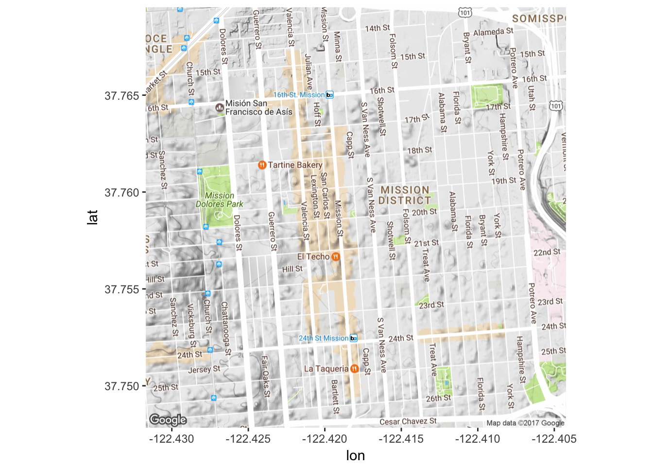 Looks good to me! Now let’s start to visualize our Twitter data. We can start by seeing where our posts are on a map.
# Tell R what we want to map
# Need to specify that lat/lon should be treated like numbers
data$longitude<-as.numeric(data$longitude)
data$latitude<-as.numeric(data$latitude)
For now I just want to look at latitude and longitude, but it is possible to map other aspects as well - it just depends on what you’d like to look at.
Mission_tweets <- ggmap(map) + geom_point(aes(x=longitude, y=latitude),
                               data=data, alpha=0.5)

Mission_tweets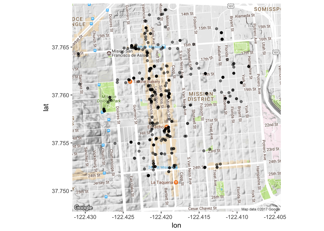
We can also look at WHEN the posts were generated. We can make a graph of post frequency over time.Graphs constructed with help from here, here, here, here, here, here, here and here.
# Create a data frame with number of tweets per time
d <- as.data.frame(table(data$created))
d <- d[order(d$Freq, decreasing=T), ]
names(d) <- c("created","freq")
# Combine this with existing data frame
newdata1 <- merge(data,d,by="created")
# Tell R that 'created' is not an integer or factor but a time.
data$created <- as.POSIXct(data$created)
Now plot number of tweets over period of time across 20 minute intervals:
minutes <- 60
Freq<-data$freq
plot1<-ggplot(data, aes(created)) + geom_freqpoly(binwidth=60*minutes)
plot1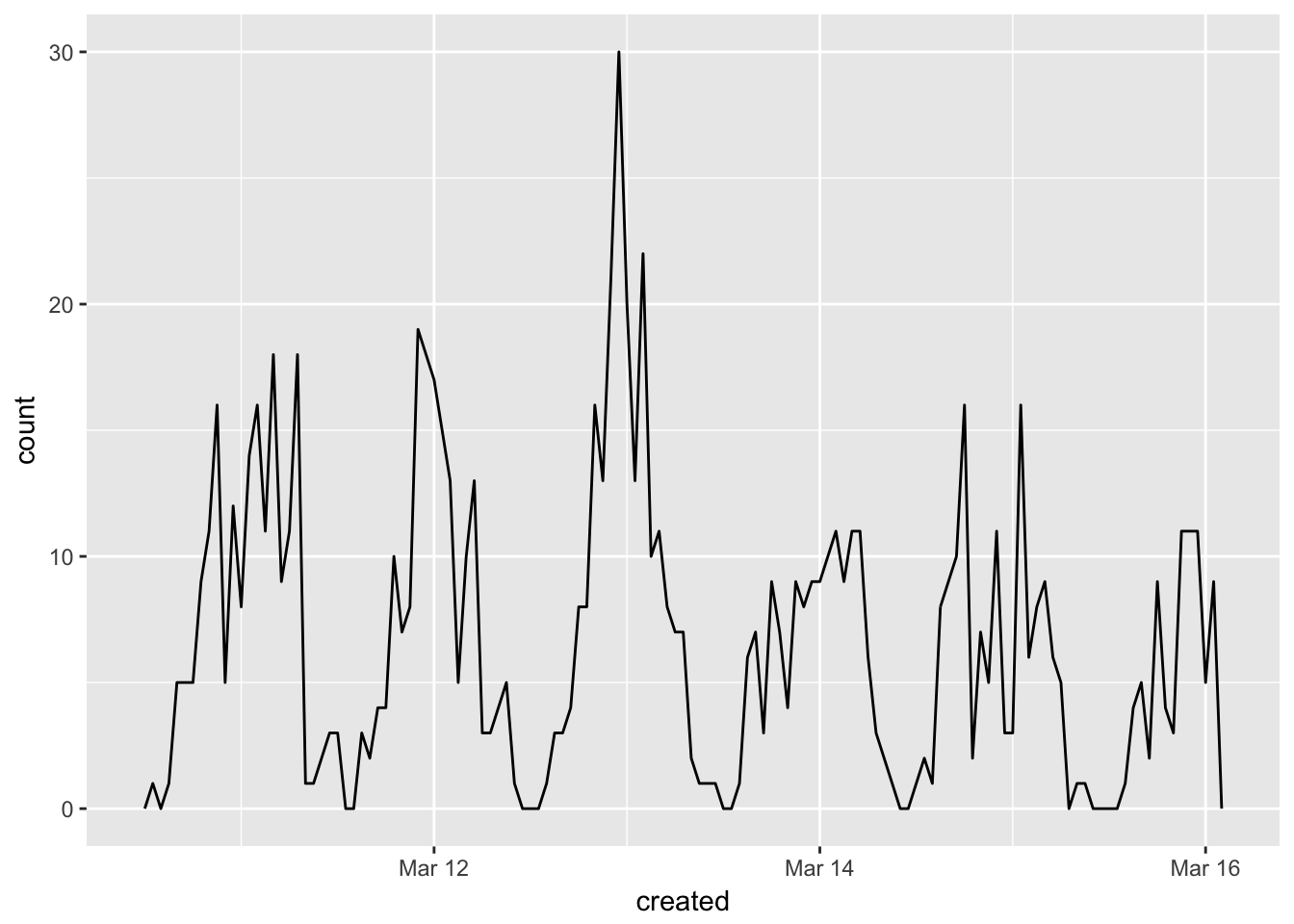 This might be more informative if you want to look at specific time periods. We can look at the frequency of posts over the course of a specific day if we want.
data2 <- data[data$created <= "2017-03-11 00:31:00", ]
minutes <- 60
Freq<-data2$freq
plot2<-ggplot(data2, aes(created)) + geom_freqpoly(binwidth=60*minutes)
plot2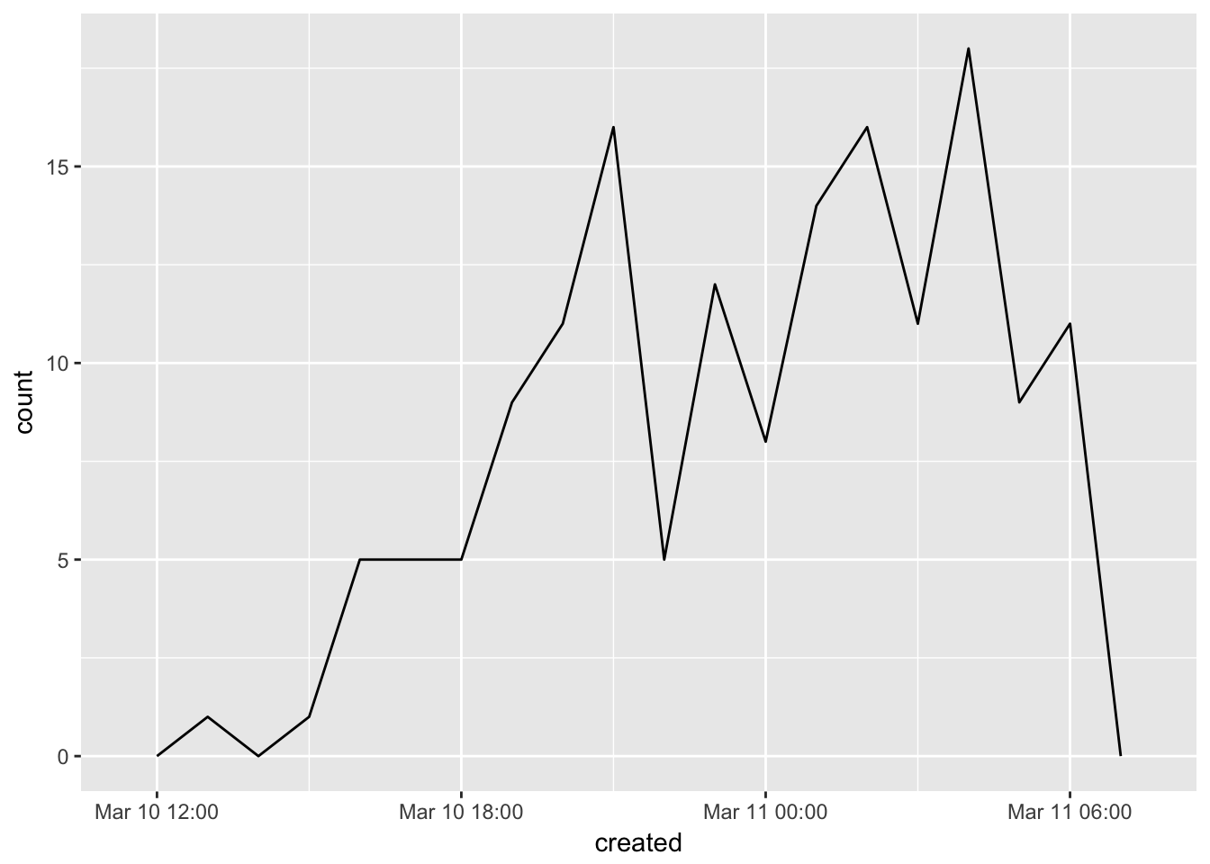
Let’s look at other ways to visualize Twitter data. I will be using a larger corpus of posts I’ve been building up for about a year (as mentioned above, I only get about 1,000 posts per searchTwitter per week so it took some time to get a good corpus going).
Some more processessing needs to be completed before looking at things like most frequent terms or what kind of sentiments seem to be expressed in our corpus. All of the following steps to ‘clean’ the data of URLs, odd characters and ‘stop words’ (a.k.a. words like ‘the’ or ‘and’ that aren’t very informative re. what the post is actually discussing) are taken from Silge and Robinson.
tweets=read.csv("Col_Sep_INSTACORPUS.csv", header=T)
# Get rid of stuff particular to the data (here encodings of links
# and such)
# Most of these are characters I don't have encodings for (other scripts, etc.)
tweets$text = gsub("Just posted a photo","", tweets$text)
tweets$text = gsub( "<.*?>", "", tweets$text)
# Get rid of super frequent spam-y posters
tweets <- tweets[! tweets$screenName %in% c("4AMSOUNDS",
"BruciusTattoo","LionsHeartSF","hermesalchemist","Mrsourmash"),]
# Now for Silge and Robinson's code. What this is doing is getting rid of
# URLs, re-tweets (RT) and ampersands. This also gets rid of stop words
# without having to get rid of hashtags and @ signs by using
# str_detect and filter!
reg <- "([^A-Za-z_\\d#@']|'(?![A-Za-z_\\d#@]))"
tidy_tweets <- tweets %>%
filter(!str_detect(text, "^RT")) %>%
mutate(text = str_replace_all(text, "https://t.co/[A-Za-z\\d]+|http://[A-Za-z\\d]+|&|<|>|RT|https", "")) %>%
unnest_tokens(word, text, token = "regex", pattern = reg) %>%
filter(!word %in% stop_words$word,
str_detect(word, "[a-z]"))
# Get rid of stop words by doing an 'anti-join' (amazing run-down of what
# all the joins do is available here:
# http://stat545.com/bit001_dplyr-cheatsheet.html#anti_joinsuperheroes-publishers)
data(stop_words)
tidy_tweets <- tidy_tweets %>%
anti_join(stop_words)Now we can look at things like most frequent words and sentiments expressed in our corpus.
# Find most common words in corpus
tidy_tweets %>%
  count(word, sort = TRUE)
## # A tibble: 27,441 × 2
## word n
## <chr> <int>
## 1 mission 3327
## 2 san 2751
## 3 francisco 2447
## 4 district 1871
## 5 #sanfrancisco 1175
## 6 park 1060
## 7 dolores 1045
## 8 sf 1031
## 9 #sf 696
## 10 day 597
## # ... with 27,431 more rowsPlot most common words:
tidy_tweets %>%
  count(word, sort = TRUE) %>%
  filter(n > 150) %>%
  mutate(word = reorder(word, n)) %>%
  ggplot(aes(word, n)) +
  geom_bar(stat = "identity") +
  xlab(NULL) +
  coord_flip()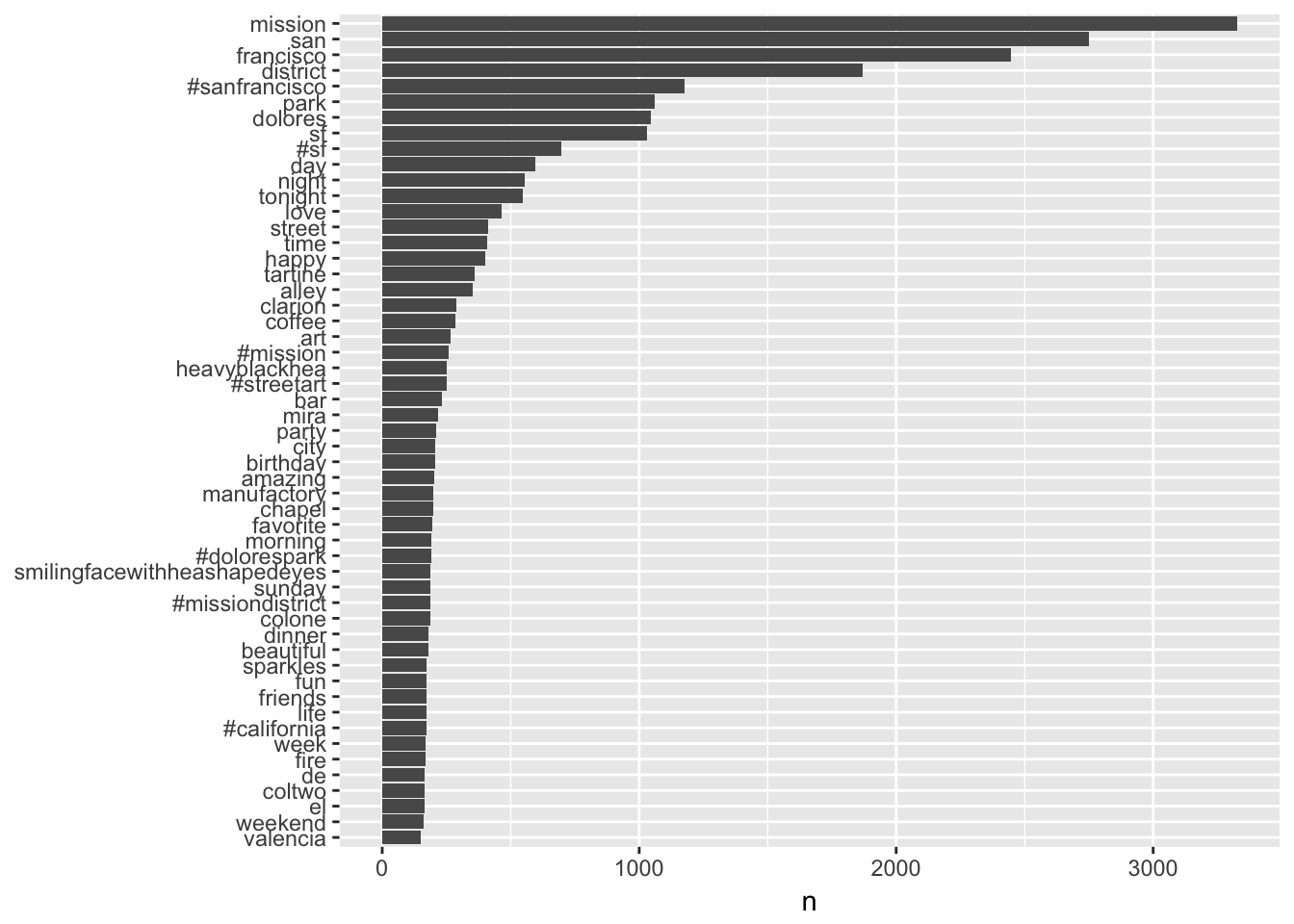
What about different sentiments?
# What are the most common 'joy' words?
nrcjoy <- sentiments %>%
  filter(lexicon == "nrc") %>%
  filter(sentiment == "joy")

tidy_tweets %>%
  semi_join(nrcjoy) %>%
  count(word, sort = TRUE)
## # A tibble: 355 × 2
## word n
## <chr> <int>
## 1 love 466
## 2 happy 402
## 3 art 266
## 4 birthday 205
## 5 favorite 194
## 6 beautiful 179
## 7 fun 173
## 8 food 139
## 9 music 126
## 10 chocolate 105
## # ... with 345 more rows# What are the most common 'disgust' words?
nrcdisgust <- sentiments %>%
filter(lexicon == "nrc") %>%
filter(sentiment == "disgust")
tidy_tweets %>%
semi_join(nrcdisgust) %>%
count(word, sort = TRUE)## # A tibble: 217 × 2
## word n
## <chr> <int>
## 1 finally 100
## 2 feeling 55
## 3 gray 50
## 4 tree 50
## 5 hanging 44
## 6 bad 43
## 7 boy 40
## 8 shit 36
## 9 lemon 29
## 10 treat 28
## # ... with 207 more rows# We can also look at counts of negative and positive words
bingsenti <- sentiments %>%
filter(lexicon =="bing")
bing_word_counts <- tidy_tweets %>%
inner_join(bingsenti) %>%
count(word, sentiment, sort = TRUE) %>%
ungroup()
# And graph them!
bing_word_counts %>%
filter(n > 25) %>%
mutate(n = ifelse(sentiment == "negative", -n, n)) %>%
mutate(word = reorder(word, n)) %>%
ggplot(aes(word, n, fill = sentiment)) +
geom_bar(alpha = 0.8, stat = "identity") +
labs(y = "Contribution to sentiment",
x = NULL) +
coord_flip()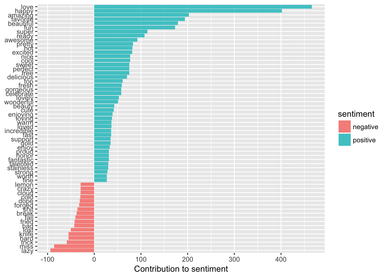
We can also make pretty word clouds! Code for this taken from here.
# First have to make a document term matrix, which involves a few steps
tidy_tweets %>%
  count(document, word, sort=TRUE)

tweet_words <- tidy_tweets %>%
  count(document, word) %>%
  ungroup()

total_words <- tweet_words %>%
  group_by(document) %>%
  summarize(total = sum(n))

post_words <- left_join(tweet_words, total_words)

dtm <- post_words %>%
  cast_dtm(document, word, n)

# Need freq count for word cloud to work
freq = data.frame(sort(colSums(as.matrix(dtm)), decreasing=TRUE))
wordcloud(rownames(freq), freq[,1], max.words=70,
colors=brewer.pal(1, "Dark2"))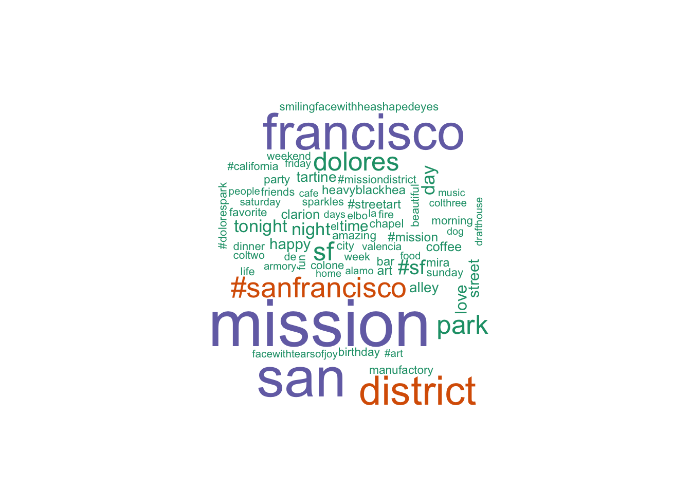
If you are interested in delving even deeper, you can try techniques like topic modeling, a process I describe and demonstrate here!